-
[css/scss] 그리드로 육각형 레이아웃 만들기CSS 2021. 1. 31. 11:55
<ul class="hex-grid__list">
    <li class="hex-grid__item">
        <div class="hex-grid__content">
            1
        </div>
    </li>
    <li class="hex-grid__item">
        <div class="hex-grid__content">
            2
        </div>
    </li>
    ...
</ul>
BEM(css 방법론 중 하나, Block-Element__Method)을 이용해서 작성했습니다.
.hex-grid__list {
    display: grid;
    list-style-type: none;
    margin: 0;
    padding: 0;
}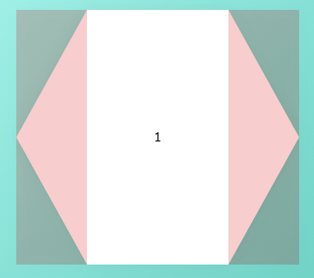
위와 같이 만들어져야 하는 것입니다.
.hex-grid__list {
    display: grid;
    list-style-type: none;
    margin: 0;
    padding: 0;
    grid-template-columns: 1fr 2fr 1fr 2fr 1fr 2fr 1fr 2fr 1fr 2fr 1fr;
}
반복을 피하기 위해서 다시 한번 리팩토링 합니다.
.hex-grid__list {
    --amount: 5;
    display: grid;
    list-style-type: none;
    margin: 0;
    padding: 0;
    grid-template-columns: repeat(var(--amount), 1fr, 2fr) 1fr;
}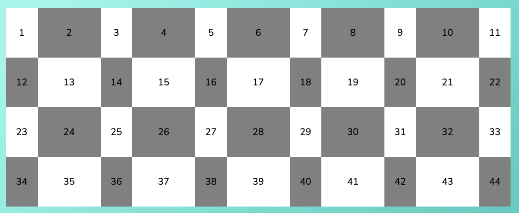
우선 위와 같은 결과물이 나타나게 됩니다.
이제 이 그리드 항목들을 배치하면 됩니다.
.hex-grid__item {
    position: relative;
    grid-column: 1 / span 3;
    grid-row: 1 / span 2;
    height: 0;
    padding-bottom: 100%;
}

.hex-grid__content {
    position: absolute;
    left: 0;
    top: 0;
    height: 100%;
    width: 100%;
    background-color: white;
}
scss를 사용해서 재배치 및 리팩토링 합니다.
$amount: 5;

.hex-grid__list {
    --amount: 5;
    --counter: 1;
    display: grid;
    list-style-type: none;
    margin: 0;
    padding: 0;
    grid-template-columns: repeat(var(--amount), 1fr, 2fr) 1fr;
}

.hex-grid__item {
    position: relative;
    grid-column: 1 / span 3;
    grid-row: calc(var(--counter) + var(--counter)) / span 2;
    height: 0;
    padding-bottom: 100%;

    @for $i from 1 through 20 {
        &:nth-of-type(n + #{$i * $amount + 1}) {
            --counter: #{$i + 1};
        }
    }
}

.hex-grid__content {
    position: absolute;
    left: 0;
    top: 0;
    height: 100%;
    width: 100%;
    background-color: white;
}
위의 반복구문을 css로 나타내면 다음과 같습니다.
.hex-grid__item:nth-of-type(n + 6) {
    --counter: 2;
}

.hex-grid__item:nth-of-type(n + 11) {
    --counter: 3;
}

.hex-grid__item:nth-of-type(n + 16) {
    --counter: 4;
}

/* ...etc */
거의 다 왔네요!
$amount: 5;

.hex-grid__list {
    --amount: 5;
    --counter: 1;
    display: grid;
    list-style-type: none;
    margin: 0;
    padding: 0;
    grid-template-columns: repeat(var(--amount), 1fr, 2fr) 1fr;
}

.hex-grid__item {
    position: relative;
    grid-column: 1 / span 3;
    grid-row: calc(var(--counter) + var(--counter)) / span 2;
    height: 0;
    padding-bottom: 100%;

    // Columns
    @for $i from 1 through $amount {
        &:nth-of-type(#{$amount}n + #{$i}) {
            grid-column: #{$i + $i - 1} / span 3;
            @if $i % 2 == 0 {
                grid-row: calc(var(--counter) + var(--counter) - 1) / span 2;
            }
        }
    }

    // Rows
    @for $i from 1 through 20 {
        &:nth-of-type(n + #{$i * $amount + 1}) {
            --counter: #{$i + 1};
        }
    }
}

.hex-grid__content {
    position: absolute;
    left: 0;
    top: 0;
    height: 100%;
    width: 100%;
    background-color: white;
}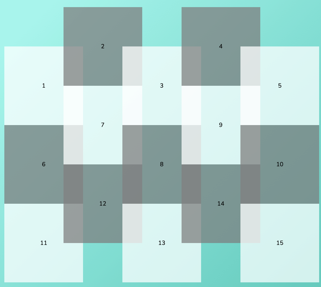
위와 같이 배치 된 사각형들을 이제 clipping 하여 보여주도록 하겠습니다.
.hex-grid__item {
    /* snipped */
    height: 0;
    padding-bottom: 90%;
}

.hex-grid__content {
    position: absolute;
    left: 0;
    top: 0;
    height: 100%;
    width: 100%;
    background-color: white;
    clip-path: polygon(75% 0, 100% 50%, 75% 100%, 25% 100%, 0 50%, 25% 0);
    padding: 2rem 25%;
}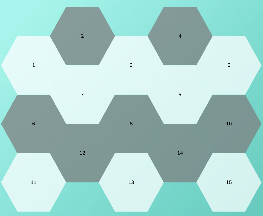
이제 gutter를 통해 여백만 조금 주면 될 듯 합니다. grid-gap을 사용해보세요!
.hex-grid__list {
    --amount: 5;
    --counter: 1;
    display: grid;
    list-style-type: none;
    margin: 0;
    padding: 0;
    grid-template-columns: repeat(var(--amount), 1fr, 2fr) 1fr;
    grid-gap: 1rem 2rem;
}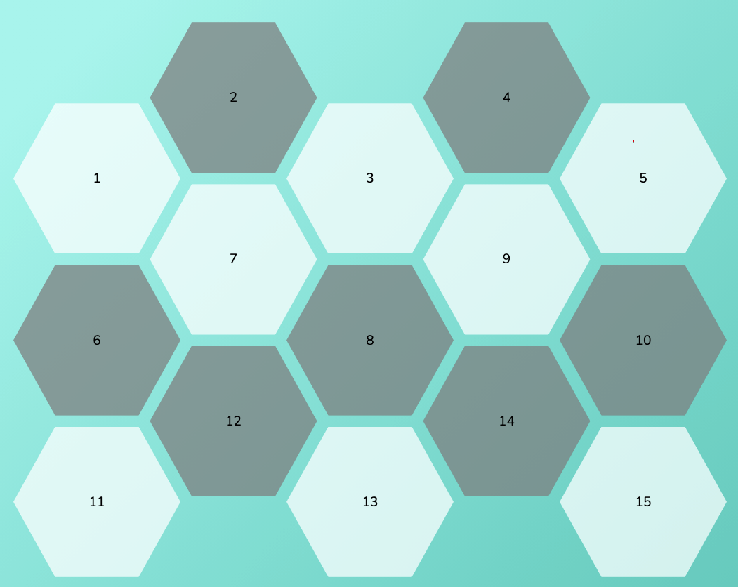
완성!!
반응형 코드까지 추가하면서 반복을 믹스인처리하면서 마무리 지어봅시다.
$block: '.hex-grid'; @mixin grid-item($amount) { @for $i from 1 through $amount { &:nth-of-type(#{$amount}n + #{$i}) { grid-column: #{$i + $i - 1} / span 3; @if $i % 2 == 0 { grid-row: calc(var(--counter) + var(--counter) - 1) / span 2; } } } @for $i from 1 through 20 { &:nth-of-type(n + #{$i * $amount + 1}) { --counter: #{$i + 1}; } } } #{$block} { display: flex; justify-content: center; &__list { --amount: 5; position: relative; padding: 0; margin: 0; list-style-type: none; display: grid; grid-template-columns: repeat(var(--amount), 1fr 2fr) 1fr; grid-gap: 2.5rem 5rem; } &__item { position: relative; grid-column: 1 / span 3; grid-row: calc(var(--counter) + var(--counter)) / span 2; filter: drop-shadow(0 0 10px rgba(#444, .08)); height: 0; padding-bottom: 90%; } &__content { position: absolute; height: 100%; width: 100%; font-size: 1.125rem; color: #111111; background-color: white; clip-path: polygon(75% 0, 100% 50%, 75% 100%, 25% 100%, 0 50%, 25% 0); display: flex; flex-direction: column; justify-content: center; align-items: center; padding: 2rem 25%; text-decoration: none; text-align: center; transition: transform .24s ease-out; } } @media screen and (min-width: 1440px) { #{$block} { &__list { --amount: 5; --counter: 1; } &__item { @include grid-item(5); } } } @media screen and (min-width: 1120px) and (max-width: 1439px) { #{$block} { &__list { --amount: 4; --counter: 1; } &__item { @include grid-item(4); } } } @media screen and (min-width: 840px) and (max-width: 1119px) { #{$block} { &__list { --amount: 3; --counter: 1; grid-gap: 1.5rem 3rem; } &__item { @include grid-item(3); } } } @media screen and (min-width: 480px) and (max-width: 839px) { #{$block} { &__list { --amount: 2; --counter: 1; grid-gap: 1.5rem 3rem; } &__item { @include grid-item(2); } } } @media screen and (max-width: 479px) { #{$block} { &__list { --amount: 1; grid-gap: 1.5rem 3rem; } } }'CSS' 카테고리의 다른 글
CSS Cascading 잘하기 (0) 2021.02.02 [Modern CSS] 3탄 CSS만으로 반응형 풀사이즈 이미지 크기 만들기 (0) 2021.01.31 [Greensock] GreenSock ScrollTrigger 플러그인 (0) 2021.01.30 flex-wrap의 wrap과 wrap-reverse의 차이 (0) 2021.01.30 아무도 말하지 않는 6가지 CSS 속성 (0) 2021.01.30